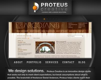
One of my big inspirations for Proteus's design intentions have been the web design techniques of Dragon Interactive and the sheer awesome quality of 2advanced Studios. If you're a javascript and jQuery freak, check out Dragon Interactive. If flash is more your style, you definitely need to get familiar with 2advanced.
2advanced in particular does periodical redesigns of the site—like most design studios, but theirs are typically exploration of some new theme or (daresay) "style". I've always done this for myself in smaller ways—technically, secondseraph.com is in version 11.0. But I'll keeping this trend with Proteus, as there are lots of potential designs and methods I want to explore. I'll save them for annual redesigns like what 2a does.
But for this one, of course, is Proteus v.1. I considered a couple of different names, all blackish minerals: Graphite, Onyx, Obsidian. I would do Onyx, besides sounding cool, but the gradients aren't shiny enough for that (maybe next time). For now though, due to the anodized or ashy quality of everything, I'll probably settle on Carbon.
Another site that influenced me: Xanthic Eye. I've known about this guy for a long time, and his designs, even though they are best suited for vanity sites, are definitely killer. I may try to make a pseudo-futuristic Proteus antimatter reactor for the next version.
But for now, I'll just stick with the basic elemental building blocks of the universe. Antimatter reactors can come later.
No comments:
Post a Comment